Thursday, May 17, 2007

Collaborative Cartography

My experiences in this course using methods of Collaborative Cartography have been valuable. I think that by posting ideas to an editable webpage, such as our Wikispaces page, cartographers are able to put out their thoughts and opinions on certain subjects and then gauge the response of others to those thoughts and opinions. At first I was concerned that the ideas I posted to the Wiki would be overly scrutinized and criticized by my classmates, but I found that not to be the case. Any comments or suggestions I received were only intended to be helpful and constructive, not mean-spirited or hurtful.

Below is an excerpt from Cartography and GIS- extending collaborative tools to support virtual teams.pdf that I think sums up the idea of Collaborative Cartography very succinctly:

“Geocollaboration is a relatively new but important area of research for geography and related disciplines. The dramatic changes in technology that are making wireless, mobile communication and data dissemination possible will have a substantial impact on how and where work is done and how individuals and groups collaborate…Thus, social, political, economic, and other geographers, who are well equipped to address these impacts, will play as big a role in development of geocollaboration as will those focusing on the underlying GIScience problems.”

Technology has allowed collaboration in many diverse settings. Collaboration can now occur in virtual meeting spots like our class Wiki, through blogging and responding to the blogs of others, through internet email or cell phone converstations, etc… No longer do you have to meet with people face to face to share and exchange ideas. Collaborative processes can now occur regardless of location as long as access to the technology is available. But, We Can't Forget That Collaboration "In The Same Room"([face to face]) Is Also Valuable And Nessecary.

FACE (:<----->:) FACE + Collaboration via Technology = GOOD CARTOGRAPHY
-----------TO

One other blog site Pat suggested we look at was called Collaborative Cartography and Location Sensing. This blog entery posed some of the possible problems of using the technologies that make collaborative cartography possible to blur the line between what is public and what is private. The blog states that "these technologies bring new abilities within the reach of ordinary people – for such benign activities as collaborative cartography and geocaching. They [the new technologies] do pose more problematic considerations when issues of surveillance and personal privacy arise. It is not just surveillance by big government, nor even by corporations greedy to learn more about consumer habits the better to target them with offers. It is also the potential for everyday surveillance of each other by each other – from that of parents watching over their children, to friends and lovers checking up on each other. "

A good point is made here. During the collaborative cartography process ideas could be stolen or ideas could be misinterpreted and then incorrectly applied. In the process of collaborative cartography your own private ideas become part of public discourse. Oftentimes this leads to better overall products because many people's viewpoints are taken into consideration and things you may not consider may be considered during collaborative efforts with others. But I think you must undertake these collaborative efforts in a situation in which you are sure of who you are sharing ideas and information with. Putting your ideas out there to see what others think is good, but having someone take and use your ideas without giving you any credit would be bad.

Having a forum in which to discuss, for example, our Nevada Atlas Pages was extremely helpful. Being able to browse previouly posted page ideas helped to spark some ideas in my own mind about possible topics that may or may not be related to the ones already posted. THE MORE IDEAS FROM WHICH YOU CAN DRAW, THE MORE DIVERSE AND WELL-ROUNDED YOUR FINAL PRODUCT WILL BE.

Virtual Worlds

-----------
examples of Virtual SpectatorRaceviewer...3-D Models, race paths, and weather layer

The virtual world that I explored was Volvo’s Virtual Spectator. Virtual Spectator’s Volvo Ocean Race raceviewer allows fans to follow the offshore legs of the Volvo Ocean Yacht Race using, “the most consummate, all-round sailing application that anyone has ever seen” according to the software producer. It is an interactive, 3-D,virtual world that uses GIS technologies like layering of weather over race paths helping to better describe the progression of the Volvo Yacht race.

This is how the software is described:
“This application is a Viewer that lets you watch the entire 2005 -2006 Volvo Ocean Race live on your PC. During the race, data from each yacht is downloaded over the Internet and displayed on a realistic 3D virtual globe, showing you where the competitors are at the moment, where they've been since leaving port, who's leading and other information. You can watch the race right up close, even from the decks of the yachts, or for a broader perspective on the race, you can switch to a satellite view showing the whole earth.
In addition to yacht positions, weather data is downloaded so you can see current weather conditions , including wind, pressure, temperature and clouds. Also, detailed statistics and measurements are available for each yacht - heading, VMG, speed over ground, speed over water, distance to finish, local wind speed and direction, and many more.”

CHECK OUT VIRTUAL SPECTATOR AT THIS LINK:
http://www.virtualspectator.com/index2.html

I downloaded the software but it was for the 2005-2006 race and none of the menus or buttons worked. I think the link to the data must have been broken or they might be working on the 2007-2008 version and stopped supporting the 2005-2006 version. But I did find some example images and screen shots online at their website.
Virtual Spectator also makes 3-D models of golf greens that show how golf balls will react when landing on a green. They make 3-D models of NASCAR and Indy Car race tracks. They also make 3-D models of rugby pitches and soccer fields. I have included some images of the various applications of Virtual Spectator Yacht Raceviewer at the top of the blog.
What I found most interesting was that the raceviewer allowed a user to add layers of data having to do with weather conditions and climatological data such as isobars of pressure, current radar images, precipitation totals and others. You could then track the yacht racers paths and see what kind of weather they might have to interact with ahead in the race.

Mapping Nevada

---------------------

Nevada in Shaded Relief---------------------An NDOT water line map


One of the first places to look for information about mapping Nevada would be the Nevada Department of Transportation. NDOT has a map info website that has links to large numbers of maps all about Nevada. There are Nevada quad maps, Nevada state thematic maps, historic Nevada maps, and the list goes on. All map links have associated .pdf pages that allow you to look at the maps in great detail.
There are maps of Nevada Indian reservations and colonies, a map of Nevada’s posted speed limits, a general Nevada map, a Nevada aviation map, and many, many more. Check out the above links to see the described maps.
It is pretty cool to have free access to all these different kinds of reliable and accurate maps created by a state agency. There are undoubtedly many more resources for finding either better or more specific maps of Nevada but they also undoubtedly cost money to get access to. These public sector maps provide basic information about Nevada free of cost.

Very"Spatial" Games


Halo for Xbox is a game that requires navigation through virtual landscapes and an acute spatial awareness and I would consider it to be a “very spatial game.” The levels are outside in forests, deserts, and alien worlds or inside spaceships, alien hideouts, and spacestations. When this game is played in multiplayer mode, each player has the goal of finding and killing the other players before they are killed. To avoid being killed you have to quickly recognize where you are in the game level. You have to associate landmarks you see in the virtual landscape and make-up a sort of mental map of the level. Or, you can cheat and play with the locator map turned on (the map has a north indication as well as a dot to represent where each player is in the level. When you play story mode you have to use landmarks heavliy because you return to check points after dying. The landscape is in some cases designed to be confusing, but a spatially aware player can avoid distraction and get right to the “shoot ‘em up.” This game is played in virtual spaces and places and those environments all have their own spatial components (scale, topography, built envioronments, natural envioronments). The game environment has so many spatial aspects to it. Below are some screen shots:
-----------

Blog Bear 2--Mapping Technology


For this blog entry I found an interesting article from FCW.com by Aliya Sternstein about how remote sensing and other advanced mapping technologies have led to a reduced need for field surveyors in the USGS. The article says that the functions of 400 federal employees at five locations will either be eliminated or transferred to an operations center in Colorado. Employees at the Colorado operations center will provide the bulk of USGS' digital mapping service operations from now on.
USGS spokeswoman Denver Makle said no work has been outsourced yet. "All we are doing at this point is studying our organization and looking at how we can get a more efficient organization based on what our customers' needs are [and] on changes in technology," she said. However, it is evident that new mapping technologies are changing the staffing needs of one of the biggest players in geospatial data, the USGS. In a market that is always changing due to the creation and application of new, advanced mapping technologies, all businesses must stay competitive, and unfortunately that means that some positions change or are no longer required.
This article makes note of the importance of field cartographers by using the example of the Hurricane Katrina disaster in 2005. The article says "during Hurricane Katrina, USGS deployed geographic information systems and field workers to plot coordinates of flood victims' homes. As soon as the maps came off the printer, helicopter pilots grabbed them and ran to their choppers. They rescued thousands of people, including 19 teachers trapped for days on the roof of Chalmette High School in Louisiana."

Blog Bear 1--Political Cartography

Politics seems to have its own brand of cartography that involves the political districting and redistricting of congressional voting districts. This is often called gerrymandering and it is the process in which a voting district is broken up or the physical boundaries of a voting district are changed in order to make it easier for one political party to win future elections. Below are a few examples of gerrymandered voting district maps:


They each show that areas in which the winning party’s constituency is most heavily concentrated get drawn into that party’s district hoping to ensure that party will carry (win) that district in upcoming elections. This can be seen most clearly in the second image. Only certian counties were drawn into the district. This process makes it very difficult for a new party to win in a gerrymandered district, but every so often a new party does win and they redraw, or gerrymander, new districts. In some cases the redrawn boundaries are so specific that they only include certain addresses on a given street. So, if on Elm St., heavily conservative, Republicans live at 2100, 2160, 3300, 3410,…, then only those addresses would be included in a district gerrymandered by a conservative, Republican winning candidate. Gerrymandering is part of the reason that local politics seem so ingrained into a region.

Thursday, April 12, 2007

3-D Cartography

The expansion of cartography in to the realm of the third-dimension has been an explosive process. It has led to the development of new ways of understanding the world around us through the application of new types of spatial analysis techniques that would not be possible in two dimensions. Below are some examples of what new 3-D cartography is out there:


Bathymetry
Much of the ocean floor is deep beneath the surface of the water, and is unmapped and unexplored. Bathymetry is the technology that allows the display of the topography of the earth’s underwater surfaces. This is one realm into which 3-D cartography is expanding. Here is a link to learn more about bathymetry


World Wind
3-D Globes
There are several examples of this new 3-D technology (Google Earth and NASA World Wind are two more well known examples). These forms of 3-D cartography are very cool ways of looking at the world and are also very useful tools for cartographers or the general public. I at least know that Google Earth has provided me with many good images to use on posters and GIS projects. Here is a link to a google earth blog that has cool google images. And here is a link to a YOUTUBE trailor that shows features of NASA's World Wind.
Google Earth

Old Map--New Map

Cartography has changed greatly from the times of hand-drawn parchment maps and compass navigation. Historic maps are exceptional examples of hard work and dedication to the art of mapmaking. But they can also help to describe how far cartography has advanced since then. Even within the last decade and a half, the change in cartographic techniques and technology has been dramatic. That is why I want to look at an example of what I would currently consider an old map (a simple Nevada highway map) and compare it to what I would consider a new map (a Google Earth satellite/road hybrid map). Below are examples of these two kinds of maps:
The “old” map is good if all you need to know is which road will take you to which city. It is not a bad map, it just has limited uses. The “new” map provides a better sense of the landscape, and the mixing of satellite imagery with a roads layer on top just looks really cool. The hybrid map shows how far cartographic technology has come. This new mapping technology is so advanced, and yet it can be utilized with a free download to a personal computer.
The Nevada highway map is advanced compared to historic maps, but seems old and out-dated itself when compared to the new technology we have at our disposal in today’s modern cartographic world. Below is an example of a historic map from the UNLV Library website:
This historic map demonstrates how far the other two examples have come in terms of accuracy and applicability, and how far cartography has come in general. Hand-drawn maps are a thing of the past and computer technology has provided the world of cartography with a new pencil and pad of paper (or should I say mylar).

Thursday, March 1, 2007

Mapping the News


MAPPING THE NEWS
Maps serve several different purposes as can be seen in some of the previoius posts of this blog. They can be used as references like in atlases, roadmaps, or You-Are-Here maps in malls to help people find their way. They can be used aesthetically as a compliment to a company logo or on a brochure or pamphlet. But maps can also tell a story or provide supporting evidence to a story. That is why maps are often used by news agencies—broadcast, print, and web-based.
Maps in the news can be used for reference purposes. For example, when an accident occurs a map may be used to show where it occurred, or a newspaper might print a story about a particularly dangerous intersection and use a map to display where that intersection is. Here are two examples of this kind of news map: From a Reno Gazette Journal story (see the bottom of the article), and from an Ames, Iowa article. Thematic maps are also used by news agencies to help support the point of a news story. This website, posted by the University of New York, Buffalo, has a lot of good examples of thematic maps used in the news. A few are below:


Map of U.S. Pollen Seasons
Aventis Pharmaceuticals Seasonal Allergies p. 8-9


Map of Mountain Lion Attacks in U.S.

This was from an article in Discover magazine about mountain lion attacks. "The moutain lion is the most widely distributed large predator in the western hemisphere. Since the 1960s, bag limits have replaced bounties and lion populations in the United States and Canada have grown to around 15,000 spreading even into some suburbs. Of the 17 fatal and 68 nonfatal attacks on people since 1890, a disproportionate number (above) have occurred within the past decade."--Caption. Source: "Is That a Mountain Lion in Your Backyard?" Discover 22:6 (June 2001): 63.


I found an interesting website posted by the Arizona Daily Star from Tucson, Arizona. It is titled Mapping the News, so I felt compelled to include it in this weeks blog assignment. It is an interactive world map with a drop-down list of countries. If you choose a country, a window pops-up and gives a short demographic breakdown and history of the country and also provides a timeline of recent major news events from that country. It is pretty cool you should check it out here.

Thursday, February 22, 2007

Interactive and Animated Cartography

ARTICLE ABOUT INTERACTIVE/ANIMATED CARTOGRAPHY
This research article is about an exploratory data analysis software system that has been developed by the authors of the article. The software is called Descartes. Descartes (formerly called IRIS) is a software system designed to support visual exploration of spatially referenced data such as demographic, economic, or cultural information about geographical objects or locations such as countries, districts, or cities. Descartes offers two integrated services: automated presentation of data on maps, and facilities to interactively manipulate these maps. This software allows for the creation of automated maps and maps that users can interact with by manipulating data or parts of data sets. The article has many good tables and example figures describing how to make decisions about how to visualize and symbolize data types, how to choose the right combination of visualization types, and an example of the look and feel of the software. The article concludes by expressing the hope that they made more clear the idea of what interactive and animated maps are and why they are useful. Here is a link to the article.


EXAMPLE OF INTERACTIVE MAP WEBSITE
The web site I found that uses interactive mapping is MapQuest. It creates maps and directions for locations chosen and entered by a user. MapQuest allows users to enter a location name, a street address or intersection, or a city or zip code and then creates a map of that area. It also allows users to enter a beginning location and a destination and then draws out direction on how to get to the destination.
Here is a link to the page of direction from my House in South Reno to the University.

Thursday, February 15, 2007

Maps and the American Identity


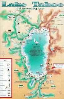
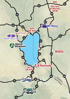
America enjoys feeling like it has its own unique idenity. That identity might be best described as HARD-WORKING and FUN-LOVING. Lake Tahoe has developed its own unique identity within the American landscape. It is a community that spans two states, California and Nevada. These two states have worked together in creating a unique identity for the lake community they share. The identity of Lake Tahoe is based in recreation, relaxation, and unmatched scenic beauty; it is America’s Adventure Place. It is an area known for its year round recreational possibilities. One might say that Lake Tahoe has focused its efforts in appealing to the FUN-LOVING American identity.
The Tahoe community has made efforts to advertise its recreational identity, and has succeeded in expressing that identity to the nation. One way Tahoe has accomplished this is through maps which display the winter, summer, spring, and fall activities Tahoe offers. These maps are posted on the internet at Tahoe visitor websites. Tahoe.com, VisitingLakeTahoe.com, SkiLakeTahoe.com, and VirtualTahoe.com are all examples of these visitor sites and all of them have maps of Tahoe. All of the maps seem to exclusively show where at Lake Tahoe people can find recreational activities. From skiing and other winter sports to boating, kayaking, and beach-going to nightlife and gaming, all these maps highlight the recreation Lake Tahoe has to offer. There is so much to do at Lake Tahoe, and these maps help show that to those who are considering visiting the region.
Maps are a good way to express the identy of a region. The identity of the Lake Tahoe community is recreation. Tahoe has become world-famous for it, and these various maps work to express that identity.

Thursday, February 8, 2007

Map Fact/Map Fiction

All maps are a form of fiction. Maps are only representations of the real world and so they are inherently fiction based. For one thing, they are flat and the earth is round. Any attempt to display a round, three dimensional object on a flat, two dimensional surface results in the distortion of the size, shape, or distance between features. Secondly, maps are only representative of some very small portion of the infinite amount of detail that our world contains. Any map must generalize the real world. Rivers and streets are turned into smooth lines and entire cities are left to be represented by single points. There is no map that is completely truthful about every aspect of a region.
With that said, maps can be used in attempts to portray spatial information as accurately as possible or they can also be used in attempts to inaccurately skew spatial information. How maps are designed and what data is included or left out often determines what impression a map will give an audience. It is left up to the cartographer to either accurately or inaccurately portray data dependent on their, or their organizations, goals for a given map. The goal of a map that is to be published in an atlas is very different from the goal of a map that is to appear in a newspaper or magazine article. The goal of an atlas map is to portray spatial data about one or many regions as accurately as possible. This is often done by using all of the data that has been gathered without concern for the way the region will be depicted by that data. Maps in atlases are the closest to what I would consider “map fact,” taking into account that in an atlas there is generally no deliberate attempt to mislead people about the characteristics of a region.
Maps to be published in a newspaper or magazine have the goal of supporting the information contained within the article or feature to which they are paired. This often involves including some information while neglecting other information. This is not due to constraints of space (which is sometimes why things are left out of a map), but due to the desire to highlight those things that support the point a writer/cartographer is trying to make by using a map.


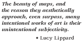
This quote by the well-known author, theorist, and art critic, Lucy Lippard, is very true. However, the subjectivity of maps can also be intentional. Maps are only a subjective view of the objective world, and that subjective view is intentionally or unintentionally shaped by a map’s creator. No map is entirely truthful. Some maps/mapmakers do attempt to come close to depicting the truth, while others have the goal of leading an audience towards their own interpretation of what is true.

Thursday, February 1, 2007

The Importance of Overall Map Design: GOOD MAP/BAD MAP

Overall map design is a very important part of producing a quality cartographic product. If a map is poorly designed, then it really doesn’t matter how good the information it displays might be. The purpose of a map is to display spatial information in a format that is easy for an audience to read and understand. If an audience cannot read a map, or has trouble making sense of it, then that map has failed in that purpose.
Map design involves the inclusion of necessary map elements such as: a succinct title, an indication of scale, a north arrow, a neatline, a map legend or proper labeling, and a proper citation or source statement. Map design also involves the balanced organization of these elements within the map. A good map should not have large areas of empty or dead space. Maps should also be designed with a visual hierarchy that makes the most important elements of the map (the map itself, the title, etc.) the largest and most clearly visible parts of the map.

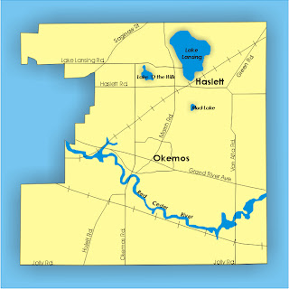
This is an example of a poorly designed map that I found on the internet. It is a township map of Okemos, Missouri used in a recent county meeting. While it would have been created knowing that those who would be viewing it would be familiar with the area that was displayed, it still lacks almost every important map element. It has no title, it has no indication of scale or which direction is north, and it has no legend. While the roads, lakes, towns, and rivers are labeled, there are what I can only assume to be railroad tracks that have no label. The roads are no different in color from the railroad tracks making them hard to tell apart. This map also lacks an indication of who created the map or where the information for the map came from. This map has plenty of room to place a legend and north arrow on the left side and a scale bar below. There is also room for a title at the top. This map is probably good enough for the limited audience of a county meeting, but there is really no reason for such important map elements to be left out. The lack of those elements leads to a poorly designed map that many audiences would have a hard time figuring out.